
LED bulbs versus an LED fixture

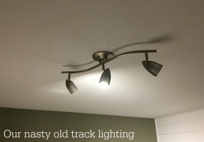
Our finished basement had the world’s worst light fixtures. They were curvy metal track lights with halogen bulbs that were constantly burning out, leaving the basement darker and dingier than it already was.
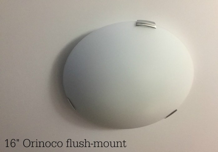
While I was converting our basement playroom into my new home office I knew I had to spring for better light fixtures. I went with two 16-inch Orinoco flush-mount fixtures ($39.99 each) with LED bulbs. They take three 60W bulbs, and they’re clean and simple — basically just huge white circles with three chrome clips.
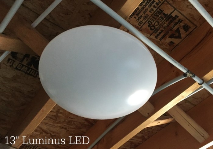
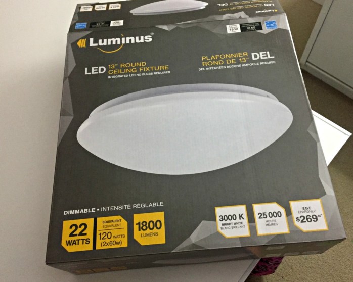
For my “studio,” a.k.a. the laundry room where I paint and use my power tools, I decided to try an actual LED fixture. I picked a 13-inch Luminus for $59.99. It’s supposed to work for 25,000 hours, which is almost 23 years if you keep it on for three hours a day — plus you never need to change a light bulb.
They look REALLY similar, don’t they? Two flat white circles?
So WHY did I choose regular fixtures with LED bulbs for one room, and a full-blown LED fixture for the adjacent room? Well, first we have to talk about lightbulbs.
After listening to a design podcast talk about colour temperature and the Kelvin scale — it sounds boring, but it was actually fascinating — I was convinced I was using the wrong bulbs. Apparently we’d been buying “warm white” (sometimes called “soft white”), which yellows everything.
I bought a new package of lightbulbs* (Luminus LEDs, 9W=60W) to try in the kitchen to see if they really made a difference. They were 5,000K on the Kelvin colour temperature scale, which put them firmly in the “daylight” category.

The second I flipped the light switch, it was like I’d flipped a switch in my heart. IT. WAS. GORGEOUS.
Everything was white! Really, truly white! Our white trim was white, our white subway tile was white, and our white accessories were white. Everything looked clean and sparkling! Our old bulbs may have been called “soft white,” but they should have been called “nasty yellow.”
So, of course, I became obsessed with these light bulbs and bought many more packages. I ran around the house like a lighting lunatic, changing out the bulbs and admiring the effect. Everything was looking a thousand times better — and cleaner — because of LIGHT BULBS!

Circling back to the new light fixtures for my home office, I, of course, outfitted them with my favourite new bulbs (hooray for 5,000K daylights!) and they looked wonderful. The once-dark basement room was flooded with clean, white light, and I loved it.
We’d moved one of the old (terrible) curvy track lights into the studio/laundry room section of the basement, figuring it would be fine in there — and certainly an upgrade from the bare bulb.
But once I was used to the brightness of my LED bulbs in my office, the studio felt like a dingy cave. So when the last of the halogen bulb died its quick, frustrating death, I gave in and bought the LED fixture I’d been eyeing (13” Luminus with 3,000K).
If you’re keeping track, that meant one room had flush mount fixtures with 5,000K bulbs (“daylight”), and the adjacent room had a 3,000K LED fixture (“cool white”).
So which setup do I like better? There are pros and cons to both.
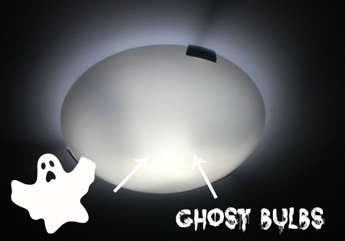
I love the clean, bright white light from the 5,000K bulbs in my flush mount fixtures ($39.99 each plus about $10 in bulbs per fixture). But while it’s not a big deal, I don’t love that you can see the ghostly glow of the three individual bulbs.
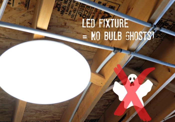
In the other room, I love that the LED fixture ($59.99 and no bulbs required) is a solid circle of light — no glowing brighter in certain areas, because the whole thing is a bulb. It even photographs differently, without the haze that I get in pictures of the regular fixtures.
But the colour temperature is definitely warmer. When you stand in that room and look into my office, you can tell the office lights have a crisper, whiter glow.
If I had a do-over, I think I’d buy all LED fixtures *if* I could get them all with a 5,000K temperature. Then I’d have the happy cleanness of pure bright white light, combined with the crispness of a solid glowing circle and the convenience of never changing a bulb.
Now, if you’re not completely bored of reading about light bulbs, I highly recommend you try a 5,000K bulb in your own home. It’s like cleaning without the cleaning — that’s how good everything looks!
What I’m learning about oil painting

Back in January I shared that my Christmas present from my husband was OIL PAINTING LESSONS — yeaaaaaaaah! — so I thought it was time for an update.
Remember my lemons? Well, our class runs in four-week sessions and I managed to finish my painting during the fourth and final class of the first session. (I’m partway through the second session now — more on that later!)
I took pictures of my progress at the end of each class so I could see how the lemons (and everything else in the painting) were changing from week to week.
During my first two-hour class, I gridded out the picture, sketched it onto the canvas, and did my “underpainting” a.k.a. It’s Just The Base Layer, Heather, Don’t Freak Out.

During the second class, I added some detail to the picture frame (teeny tiny nervous brushstrokes) and my instructors described how to start making certain areas lighter or darker — “highlighting and shadowing.” Instead of a watery-looking green background that was mostly one colour, I darkened the right side which gave everything a bit more dimension.
One instructor kept urging me to put “big white splotches” on the lemons for their highlight, and I was SO FRIGGING SKEPTICAL because since when does a “big white splotch” sound like something that’s gonna turn out nicely? Really? But I did it, and she was SO RIGHT. Now I’m all about the big white splotch. 😉 Read More
When your kids accidentally watch Bad Moms Christmas

The kids and I had a VERY interesting conversation last night, a full eight nights after they returned from a weekend at my mom’s. Apparently, in between repeat viewings of Willy Wonka and the Chocolate Factory, they screened … something else.
MY INNOCENT CHILD, AGE 7: “Yeah, we saw this movie where the lady’s job was massaging vaginas.”
ME: “WHAT?! What are you talking about? WHAT DID YOU WATCH?!”
CHILD: “It was called, like, The Bad Moms Have A Christmas.”
Nooooooooooo!

Easy TV cabinet makeover

My new home office is so close to being finished. After painting the walls, redoing furniture, building custom pieces and working on artwork and accessories, I thought I was ready for the big reveal.


And then . . . I realized there was a blue elephant in the room.

A couple of years ago, a friend gave me an old hutch she no longer needed. I painted the lower half white, and it now blends in with the hutch in my dining room.

The top half went down to our basement where it became a media cabinet — holding the digital box, DVD player, etc. below our wall-mounted TV.

At the time, that room was a family room/playroom/guest room with plenty of colour and activity. It was only the basement, so I had fun with the hutch and painted it a rich royal blue (Liberty Blue by Fusion Mineral Paint).
That colour worked well for years, and I figured it would be fine in my new home office. But once the toys were removed and the board-game wall was dismantled, I realized I loved the “peaceful” direction the room was taking.
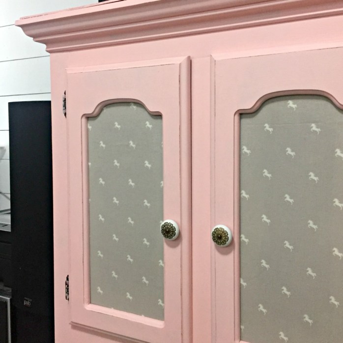
We repainted the deep grey walls and now they’re a creamy light greige (Benjamin Moore’s Edgecomb Gray). All of the furniture is now white or a soft wood tone. There are pops of gold and a healthy dose of a “millennial pink,” and the bright blue media cabinet started looking monstrous against the white shiplap …

This was one of those spur-of-the-moment DIYs where I have absolutely no intention of starting something, and two and a half hours later the whole thing is finished. I had half a bottle of pale pink paint leftover from doing our daughter’s lockers (“English Rose” by Fusion Mineral Paint), and I thought “Yep, let’s do it.”
I unscrewed the knobs, took out the glass panes in the cabinet doors, gave the whole thing a quick wipe — it was VERY dusty — and went to town painting it before I realized what I was doing.
Since I wasn’t sure I had enough paint, I cheated and only did the front, the top, and the side that’s visible. (The other side is hidden by the mini-fridge.) I managed to cover the blue paint using every last drop of pink.

While the paint dried, I looked at the panes of glass. I thought about frosting them so they’d hide the ugly electronics we store in the cabinet, but I didn’t feel like going to the store. Scrapbook paper was too short. Thick sketchbook paper was pretty, but also too short.
My next thought was to use wrapping paper, but the only possibilities were black and white stripes (cute, but too bold for the rest of the room) and a clashing pink pattern. Now, I could have easily gone out and found the perfect wrapping paper — maybe something white and gold? — but when I’m mid-project, I do NOT want to stop and go shopping.
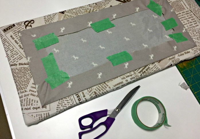
I started digging around in my fabric bins and decided on a soft grey cotton printed with tiny white horse silhouettes (“Equestrian” by Camelot Fabrics).

After a hot, steamy iron to get out the wrinkles, I cut fabric rectangles slightly larger than each pane of glass. Then I pressed the glass against the fabric (“good” side down) and wrapped the fabric back around the edges — securing it with strips of painter’s tape. #usewhatyouhave
The fabric-wrapped panes slipped back into their places easily, except I couldn’t tighten the screws as much since they were thicker. The paint was dry, so I roughed up the edges with a bit of sandpaper to distress the finish.
The final step was cutting the remaining fabric into a long strip, hemming the bottom, and stapling it to the underside of the hutch — making a little curtain to hide the larger electronics stashed underneath. I’m very glad I no longer have to look at them every day! When you marry someone who insists on keeping every cord, every speaker, every dusty piece of equipment — “just in case” — you have a lot of electronic junk that needs hiding.

Now, when I turn the corner to walk into my new home office, there is no longer a huge blue beast jumping out against the white shiplap wall. There’s a soft pink cabinet that blends in beautifully with the rest of the white, wood, and pink room.

Of course, now it’s the TV — right above it — that’s kind of a distraction. It’s a big black rectangle against the white wall. I tried to minimize it by hanging a white ceramic ram head above it, and we *do* use it as a computer monitor so it can’t really be helped.

Still, I wonder if anyone’s ever sewn a slipcover for a TV? 😉


My DIY dreamcatchers were a nightmare

It all started, as most DIY disasters do, with the prettiest Pinterest image. Whimsical DIY dreamcatchers with gold beads, rustic twine, and pastel-coloured feathers.

Surely I could make that! DIY dreamcatchers would be an easy project and look great in our daughter’s bedroom.
I picked up a couple of thin gold hoops and some packages of beads — metallic gold, but also plain wood so I could paint them.
I couldn’t find feathers in the soft colours I wanted (pale purples, pinks and blues) so I bought plain white goose feathers and figured it would be easy to dye them.
The last item on my list was thin strips of leather, so I ended up buying a quarter-metre so I could cut it into strips myself. I was pumped to get started. I was so overly confident that I actually thought, ‘Maybe I can start making these to sell. DIY dreamcatchers would be so popular!’
Oh, if only I knew then . . .

Continue reading in my weekly DIY column, My Handmade Home …


As featured on …